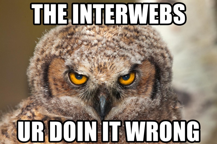
What NOT to web
What NOT to web

We know we send you a lot of articles on improving your online presence. They’re usually a cheery blend of pointers, theory and friendly advice. Well, this issue’s going to be different. I’m in a crabby mood, durn it, and I’m writing a curmudgeonly column. So there. (We’re friends. We can share our true feelings, right?)
So here are some website design issues that just … Really. Hack. Me. Off. And I bet they’ll make your left eye twitch, too.
1. Complicated or unclear navigation
This takes several forms:
• Sideways scrolling: OCR
Seriously? You expect me to bumble around the page to make navigational arrows appear, and then be unable to see anything on both the left and right sides of the site simultaneously? Get stuffed.
• Too many clicks (or scrolls), for naught: ShoWeb
I’m turning a blind(ed) eye to the multitude of problems this site has, and focusing on one: there are eleventy-dozen nav buttons on the home page, and no sub-categorization of any kind to be found once you click one of them. Let us at least be able to sort by location, and stop putting the alphabetical jump-link buttons at the bottom of the stinkin’ page!
• What the what? Enritec
This is an example of what Webpages That Suck would call “mystery-meat navigation,” because there is no clear way to navigate to the information you want. You’re just supposed to sit there and wait for the pertinent topic to fly by, or on other sites, figure out which button takes you where (assuming you can figure out where the main nav even is).
2. Legibility issues
• Tiny text: The Houston Chronicle
Oh, the irony!
Although there is a keyboard command that helps alleviate this problem in many browsers (CNTL +), I – and everyone over the age of 15 – would appreciate it if the ding-dang type was a reasonable size already.
• Lack of contrast between text and background: iTunes
Even the big boys get it wrong some times.
3. Overly dense text: The Bolen Report
In old newspaper parlance, this would be referred to as “rivers of grey,” meaning you see stream upon stream of black text against a white background. Mud. Don’t get me wrong; your site needs lots of good content. Google – and us regular ol’ humans – love it, but c’mon people. Give the look some air, will ya? Frequently, this is a variant of …
4. Lack of focus: Harbor Freight Tools, Pine-Sol
Even Pinterest is guilty of this. You just don’t know where to look first. Or next. And then … (insert brain-exploding noise here).
This is only the beginning. There’s tons more out there to get up my nose, and don’t think you won’t hear about it. I’m only stopping here because Michael and Steve told me to. (Note to self: write incendiary post about the evils of editing.)
Sigh. The takeaway from all my ranting (thus far) is: Everybody makes mistakes occasionally, even the pros. Anyone who’s been around long enough is bound to have made at least one of these boo-boos in the course of their online lives. As long as you – and the people who help you develop and maintain your web presence – learn from it, no harm, no foul. But at least it’s given me something to kvetch about on a Wednesday morning.
And hey, it could be worse. You could be this guy. Mr. Bottles
Thanks to eConsultancy, Lounge Lizard, and the ever-fabulous Webpages That Suck for the examples of truly stinktacular websites.
If your website is making you (or someone you love) gripe uncontrollably, then give us a call at (910) 452-6345 and see if we can help make your day a little brighter with a truly spectacular website.
Updated: 10/30/2023
Categorised in: Getting Creative
This post was written by admin


Comments are closed here.